19 Jun The Problem with Modern Architecture

Note: Originally published by Carl Seville on Green Building Advisor.
Over my now decades-long career in construction and renovation, I have rarely attended any home tours, but I recently went on a tour of modern homes in Atlanta sponsored by a group called, quite appropriately, Modern Atlanta. The tour included ten single-family homes (I saw eight of them) and one commercial building, the new Atlanta offices of Perkins + Will, a LEED Platinum renovation, which I did not visit.
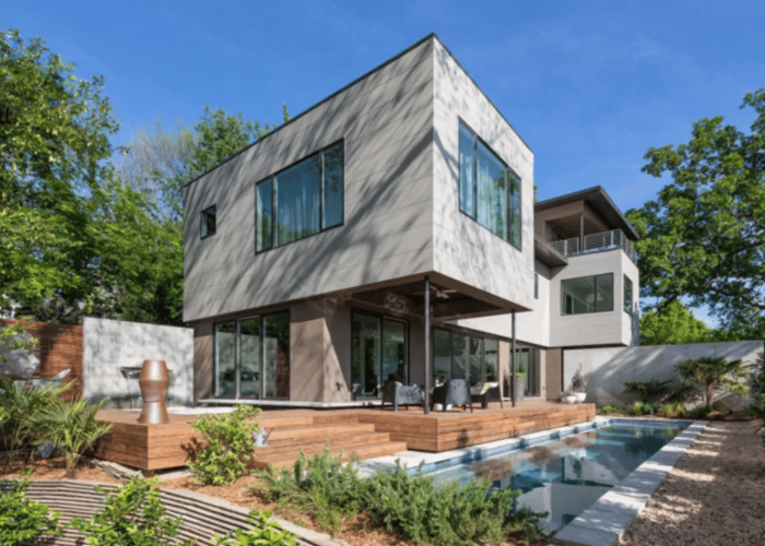
Now I tend to not prefer modernist architecture – most of which features flat roofs, few if any overhangs, and (usually) lots of glass. I did, however, keep an open mind when touring the homes, but this didn’t keep me from being critical of the projects where appropriate.
The good
My favorite home on the tour was the combination home/office by TAC studios. For starters, the size was modest, the spaces comfortable, the views great, and, what made me the happiest, the details were well designed and executed. On top of that, the location is exceptional.
At the end of a dead-end street in a formerly seriously scary neighborhood (where I had an office many years ago, so I know), this house is adjacent to two walking and bike paths, one current and one in development, and is very accessible to all sorts of retail and commercial amenities. I am looking forward to an invitation to drinks and/or dinner on their top-level covered patio soon. (Are you listening, Cara?).
Another home that was understated and well-crafted was a simple home in the suburb of Roswell. Although it has a flat roof, the designers managed to include reasonable overhangs to protect the building from the rainy climate and provide some shading. The exterior detailing was refreshingly traditional: corner boards and lap siding. These details are sure to be durable with minimal maintenance. The house was conditioned with minisplit heat pumps, a nice touch that is rarely seen around these parts.
The Bad
Most of the rest of the homes on tour didn’t do much for me. Each had some nice spaces as well as uncomfortable or marginally useful ones. There was lots of talk of spray foam insulation and geothermal heat pumps, but I saw little real house-as-a-system thinking.
What I found bothered me the most were the furniture-like exterior details that weren’t going to last, many of which were already beginning to fail. For example, V-joint tongue-and-groove siding with flush trim or exterior miter joints were showing significant movement on these fairly new homes. I appreciated the gapped siding rainscreen details, although I always wonder how often they need to clean out the spider webs from the cracks.
One home had a long wall of floor-to-ceiling storefront glass, facing south, minimally shaded, lighting a hallway with wood floors and drywall walls and ceilings. This feature was incorrectly labeled “Passive Solar Design.”
The Ugly
On entering the largest house on the tour, one of the guides/guards at the door smiled at me. When I asked her why, she said she liked seeing the expressions on visitors’ faces when they came in.
Within a few minutes, I understood why. This house was immense, complicated, and had possibly the most bizarre interior finishes I have ever seen in my life. Someone described it as having been decorated by Austin Powers. The home is listed as being EarthCraft-certified, and like most of the homes on tour, it used spray foam insulation and was fairly well built, but man, was it big and strange.
The most personally irritating detail was the 5’6” doorway to an interior balcony. I learned the opening height after a close encounter with my forehead. And then there was the indoor shooting range!
But Are They Green?
In general, all the homes I saw were a big step up from the typical builder-grade home in terms of insulation, air sealing, weatherproofing, and general attention to detail. Several of them are or will be certified under one or more green building programs — better than if they weren’t.
I would have liked to have seen more consideration of solar orientation, material durability, and simpler volumes to keep construction and energy costs in check. I think there is a place for climate-appropriate, high-performance modernist homes. I saw a couple on this tour and look forward to seeing more in the future.


No Comments